Georgetown Public Policy Review's Visual Identity
Basic Data Visualization Style Guide for GPPR |
|
|
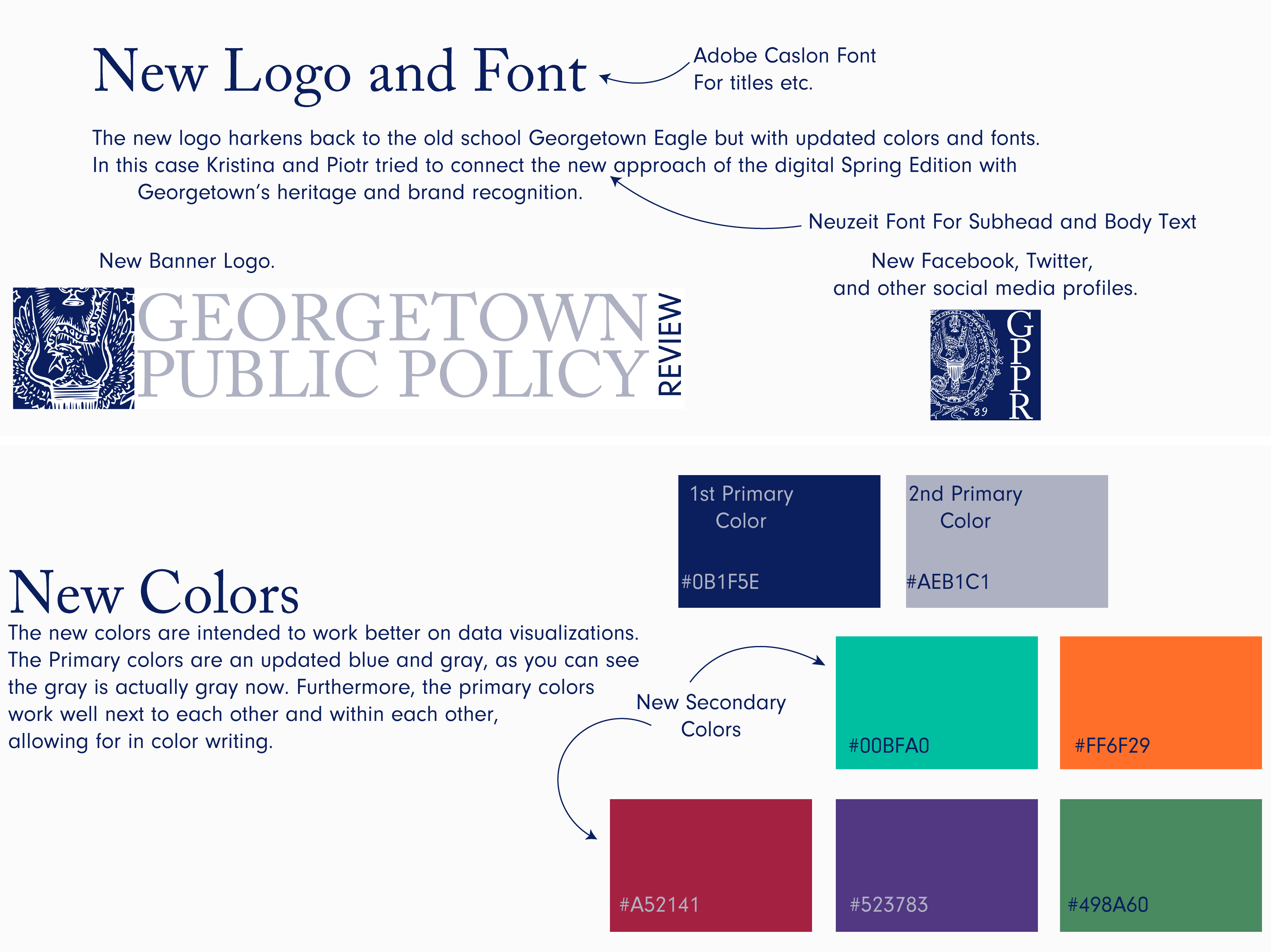
| In 2015/2016 was a year where GPPR moved from a primarily print format into a purely digital sphere. After being appointed to the board, my co-Senior Media Editor Kristina Rodriguez and I, as well as the Editor In Chief Justin Goss decided to refresh the color scheme for GPPR for the digital age. The above styleguide was applied to data visualizations for GPPR's articles as well as for GPPR's Spring Edition. The blue and gray are both primary colors of Georgetown university, however, in this case the colors were adjusted to the digital era and the secondary colors selected to compliment the primary colors. |
GPPR Logos |
|
|
|
|
| This was the main logo I designed during the summer of 2016. This designed updated the feel of GPPR from the old logo that failed to convey the association GPPR had with Georgetown University. Furthermore, it did not contain the new color paletted created by my co-Senior Media Editor Kristina Rodriguez. This logo applied the classic Georgetown eagle on a blue background. Rather than relying on a niche door outline of the Old North, the eagle directly harkens back to Georgetown's tradition, with a focus on the distinct eagle head. |
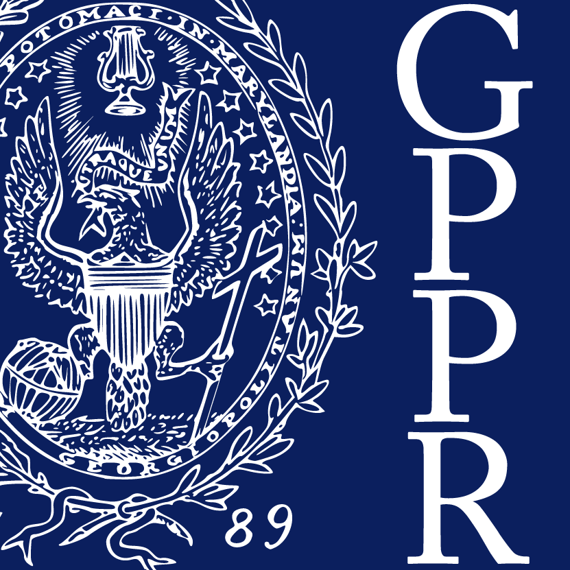
This logo was developed based on the new scheme and font with Twitter/Facebook in mind and the restrictions the profile picture poses on logos and visibility on a computer screen as well as on mobile decides. The logo incorporates most of the eagle since Twitter/Facebook provide profile pictures at a much lower resolution and thus needed to reemphasize the eagle and the acronym of the review in a confined space. |